I was getting increasingly frustrated with whatever I was busy doing the past few days, so I decided to write this post instead, now I feel much better. It’s great how a shift in attention can change one’s demeanor – another reason why you should write blog posts or code when temperamental science delivers its regular dose of non-nice things.
The Plot
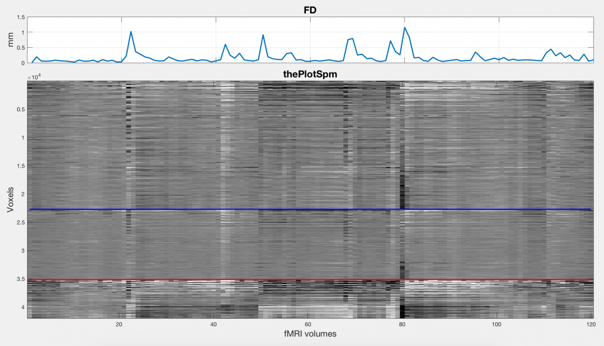
“The Plot” (also referred to as a carpet plot, grey scale plot or intensity plot) is a great way to visualize your fMRI time series data in order to easily highlight quality issues. Jonathan Power wrote a nice paper in 2017 explaining its use: “A simple but useful way to assess fMRI scan qualities“. Additionally, you can find more resources related to The Plot (including code) here on this website, which also contains multiple other (very useful) resources for fMRI quality, denoising and analysis. In this post, I’ll first explain my understanding of the use of The Plot, and then present some SPM12 and Matlab code (with explanations) that you can use to generate it for your own fMRI data. But first, a picture:
What is it and why is it useful?
The Plot is essentially a 2D plot of scaled fMRI voxel intensity values over time, with voxels on the vertical axis and time on the horizontal. Voxels are ordered into segmented bins, typically grey matter, white matter and CSF, all of which could be ordered into deeper cortical-level parcellations. In this way, one can see how the voxel intensity values change over time for grouped (and directional) areas of the brain. If you are familiar with fMRI processing, you will know that it is important to correct for subject head motion during the preprocessing step of the analysis. Typically, this step entails realigning all images in the series to the first or mean image of the series using a 6 degree of freedom rigid body transformation, but it could also involve removing (scrubbing) certain bad-quality time points from your time series if motion is particularly bad at those points. Using The Plot, one can actually visualize the effect that motion has on the intensity of brain voxels over time, as well as identify high-motion outliers.
Another useful addition to The Plot is the time series of framewise displacement (FD), which is an indication of how much the subject’s head moved (apparent movement) during each frame or time point. This can be used as a nice (and automated) indicator of movement outliers, and as you can see on the figure it correlates visually with sudden intensity changes in The Plot. More traces like FD could be added to add value to the visual inspection of your fMRI data, including differential variance (DVARS), subject physiology traces like heart and breathing rates, and the time series of the 6 realignment parameters. (At some point I’ll add code to plot these as well, for now we only have the FD trace).
Finally, with the correct preprocessing, parameter selections and plot scaling, you might even be able to see voxel intensity fluctuations mirroring subtle breathing or heart rate changes of the subject, as Jonathan Power explains in his paper. For breath hold tasks, the intensity changes are particularly visible, and distinct from changes related to head motion.
Thus, The Plot is a great (and simple and easy) way to visualize multiple quality metrics and time-series data related to a full fMRI dataset, and will allow you to make a number of quality judgements based on a single look. It has since been incorporated into an AFNI function by Box Cox and it’s also used in the visual summary report of MRIQC. I routinely use my script to assess new data that we acquire at our lab, or open datasets that I work with, and I would recommend all fMRI researchers to use some version of The Plot for routine fMRI quality assessment. Additionally it can be a nice way to assess differences in visual data quality outcome based on some change to the preprocessing pipeline (e.g. smoothing versus no smoothing, or physiological noise correction versus not doing it).
What about the code? Because I am partial to Matlab and SPM, I created a Matlab-SPM12-only version of The Plot (the one shown in the figure), by adapting code from Jonathan Power and adding some of my own scripts. Code is available in my Github scripts repo. Below is a short step-wise explanation of the code (although, I recommend reading the article for a more in-depth understanding). For a more in-depth explanation of how I tend to use SPM12 and Matlab scripting, including code, see my previous series of posts.
Scripts and input data:
The main script that creates The Plot is called thePlotSpm.m. Most steps are automated, with the basic requirements that you should have SPM12 installed and located and that you should add the locations of the files needed for processing, which includes anatomical and functional data.
In the figure above, I used single subject open data from the ABIDE dataset, which includes an anatomical image and a functional image time-series.
They are required in this format:
- Subject anatomical image (3D NIfTI)
- Unprocessed fMRI time series (4D NIfTI)
Processing:
The script needs to run a few processing steps before it can actually plot The Plot. This is done mostly via the thePlotSpmPreproc.m script, which uses SPM batch scripting to run a number of preprocessing steps. These include:
- Realigning all functional images in the time-series to the first one (this is only to get the head movement parameters in order to calculate framewise displacement; The Plot is typically a plot of unprocessed time-series data)
- Coregistering the anatomical image to first functional image (in preparation for the next step)
- Segmenting the coregistered anatomical image into standard tissue types (grey matter, white matter and CSF)
- Smoothing the unprocessed and realigned functional data (this essentially allows 4 versions of the data to be plotted, raw (un)smoothed and realigned (un)smoothed)
- Preparing data for The Plot:
- Removing the mean from and detrending the movement parameters
- Calculating framewise displacement
- Creating brain mask from segmentations
- Calculating percentage signal change (from the mean) for the masked fMRI time series
Plotting The Plot
To get everything into a nice figure, we vertically concatenate sections of the scaled fMRI time-series data based on the bins: grey matter on top, then white matter in the middle, then CSF. Because I use SPM12’s segmentation function, I only get segmentations for a number of tissue types, and no further segmentations for deeper structures within these tissue types. This is one of the main ways in which my script differs from Jonathan Power’s version, as the original version uses Freesurfer for segmentation which allows improved parcellation options.
Finally, we plot the resulting intensity values over time, we plot separator lines to separate the tissue types, and we plot the framewise displacement over time. The result is as you see in the figure, with the (future) options of adding additional traces like subject physiology or DVARS.
Please note that my script and resulting plot is in no way more robust, accurate or visually pleasing than the original. It uses different toolsets and makes a number of different assumptions for various steps in the processing pipeline. It may very well be less suited to highlight fluctuations related to breathing rate changes, for example. I plan on testing it more in future, which will hopefully lead to improvements. Please let me know if you have suggestions. Overall, though, it is still a pretty useful tool for a quick quality assessment.